One of my favourite bits of my job is putting colours together. Although I’ve been doing this for well over a decade I still find lots of new ways to put colours together. Sometimes that comes from packing orders, and I try to resist the temptation to write a note on the invoice saying I hope the yarns are going to be used together. Sometimes it’s seeing a colour combination either in real life or when I’m using the computer.
I’m very aware that it’s so much easier to mix and match colours when the yarn is in front of you. I’m grateful that the internet lets us sell yarn all over the world, but picking colours from a screen is tricky. I colour check my screen and make sure the photos look like the real yarn – but you’re looking at your screen not mine.
So as we’re about to have lots of new Britsock colours in the shop I’ve taken photos of some colour combinations to let you see how they work together. As always if you want to see how colours look I’m happy to take a quick photo for you – just get in touch and let me know what you’re after.
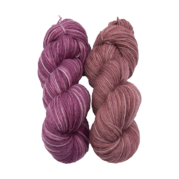
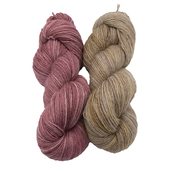
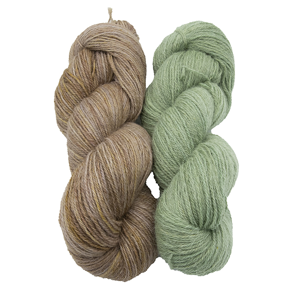
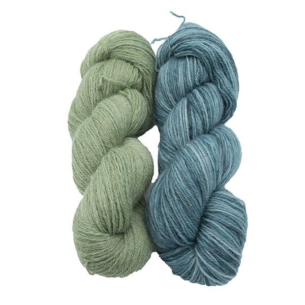
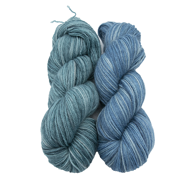
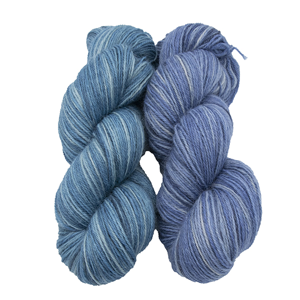
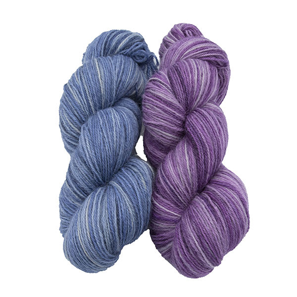
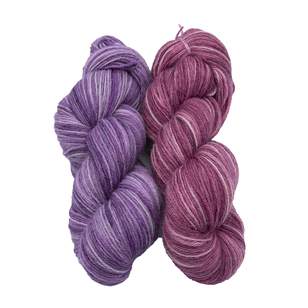
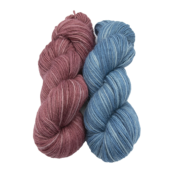
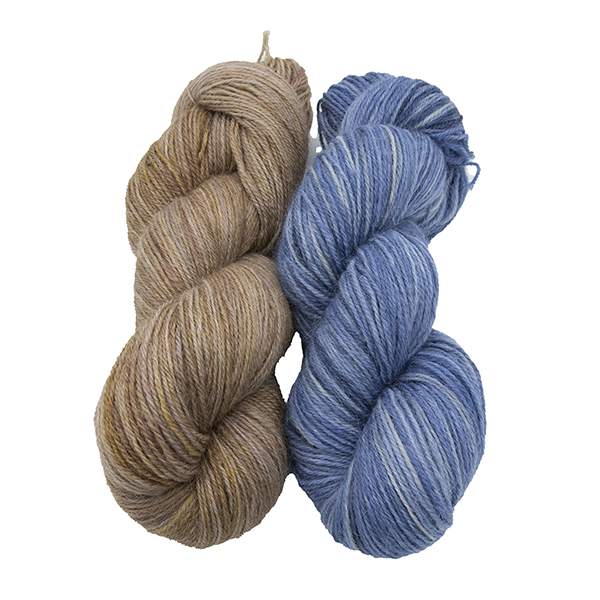
Let’s start with pairs of colours – these pairs are closest to each other so they’re ideal if you don’t want a dramatic colour shift.
What if you want more contrast? There are a couple of approaches to this. One is to pick a much lighter or darker colour, and I’ll post pictures of those tomorrow. If you’re a fan of the graphic effects that working with black and white give you the lots of difference in the depth of your colours might be for you.
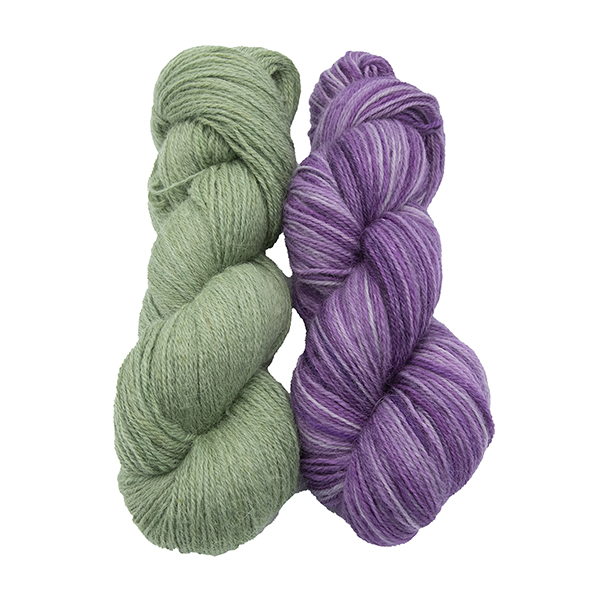
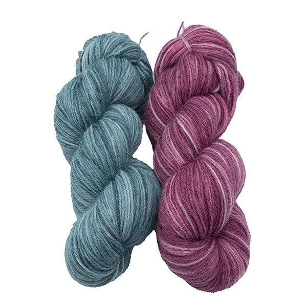
If you want to keep your colours with a similar depth and have contrast then look at picking colours which wouldn’t be next to each other on the colour wheel.
Tomorrow I’ll blog about possible combinations for working with a darker colour. If you’re reading this before 1430 on the 14th of July the links will take you to a page that says no products found. New stock will be added to the shop on Wednesday at 1430 – and if you’d like access to the special offer that’s going out to our newsletter subscribers then sign up here.
Recent Comments